What Is Value in Art? Definition, Examples, and Importance
Take a color photo, desaturate it, and turn it black and white. Aesthetically pleasing pictures turn into something that looks grey and bland, while some retain their artistic appeal. What is value in art?
The value in art determines the arrangement of the object in space and its spatial relationships. The concept of value is one of the most underestimated, misunderstood, and overlooked parts of any creator’s path. People often forget to consider it when they try to focus on the importance of colors, subjects, and techniques, leading to unsatisfying results. In most cases, the issue stems from the incorrect usage of values.
This essay will explain what value in art is, how it works, what references there are in the works of artists, and how one can begin to use it.
What Is Value in Art? A Simple Definition
Value in art refers to the lightness or darkness of a color or tone. It expresses how much of the light falls on a surface, regardless of its color.
- A value is one of the seven common elements of art, along with line, shape, form, space, texture, and color. A quick search for the value art definition may return slightly different answers, but they should all relate to how light or dark something is.
- There are also two notes about value. First, the value is not a color. Two colors may be very different from each other (like yellow and blue), but their value may coincide, and two yellows can have extremely different values.
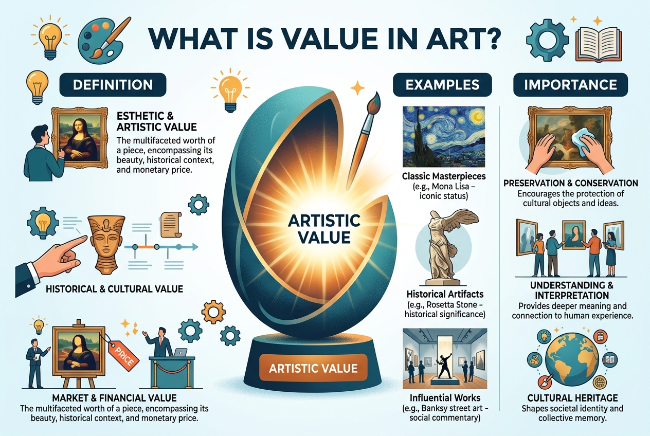
- Second, the value does not have anything to do with worth. In common usage, value refers to value in an economic or personal context. The art definition has nothing to do with this – only with light and dark (except, perhaps, the market value of a piece of art, which is discussed at the end).
Understanding the Value Scale
Artists describe value using a value scale, a strip that moves from pure white through a series of grays to black.
A common teaching version uses nine steps, though some use five, seven, or eleven. The number does not matter as much as the idea: every tone you see can be placed somewhere along this line.
You can think of the scale in three broad zones:
| Zone | What it looks like | What it often does in an artwork |
| Highlights and light values | Near white to pale gray | Draws attention, suggests light hitting a surface, feels open or airy |
| Midtones | Middle grays | Carries most of the information, describes form and texture |
| Shadows and dark values | Deep gray to black | Adds weight, depth, and drama, anchors a composition |
Key Terms Connected to Value
There are a few terms that I think are necessary to learn before discussing the image:
- Tint: a shade of a particular color achieved by mixing it with white. It results in lighter hues.
- Shade: a combination of a color with black. As a result, you get darker hues.
- Tone: a mixture of a shade with gray. In terms of value, the term tone also refers to the lightness or darkness of a color.
- Hue: the pure color itself, without any addition of light, darkness, or gray. It is also the color name, such as green or red.
- Contrast: the ratio of light to dark values.
- Key: the range of values in an artwork. A high key means that the piece has more light areas, whereas a low key dominates dark tones.
- Chiaroscuro: the use of strong contrasts to produce dramatic effects that give the illusion of volume.
The Elements of Art: Where Value Fits

Value is one of the core elements of art, but rarely functions independently. It serves to enhance and transform the other elements.
- With form: Value is the key element in creating the illusion of form. A two-dimensional circle gains dimensionality when contrast is added to its value.
- With space: A value of light gray will recede into the background while a dark value will appear close to the viewer. It explains why distant mountains appear lighter and blurred.
- With color: Individual colors possess different values. The knowledge of values is essential for color mixing and avoiding unwanted color schemes.
- With texture: Contrast in values is used to depict a rough or smooth surface.
- With line: Heavy lines appear close, while light lines suggest a faraway gaze.
When studying the elements of art, value is often the most rewarding to practice because it enhances realistic depiction, as well as the overall clarity of an image.
Why Value Is Important in Art
Value is much more than an academic exercise. It has a powerful influence on the way a viewer perceives an image. Here are the key roles it plays.
- It Creates the Illusion of Form and Depth
We perceive three-dimensional objects in our world primarily through the contrast of light and shadow. A form is suggested by the fact that one side is lighter (lit) and the other is darker (in shadow). Value contrast is necessary to create that illusion of mass.
- It Guides the Viewer’s Eye
A viewer’s eye is naturally attracted to the point in an image where the contrast of value is at its maximum. The artist can use this to his advantage by placing his focal point (the subject of the work) there. It’s a simple but powerful tool.
- It Establishes Mood and Atmosphere
The value structure of an image has a psychological impact on the viewer, for better or for worse.
Low-key images (those with a mostly dark value structure) often seem menacing, mysterious, or moody.
High-key images (those with a mostly light value structure) seem airy and ethereal.
Images with a tight value structure (values close to each other) seem more mysterious and less defined.
- It Defines the Image Clearly
A well-executed value structure will allow a composition to be understood at a glance. For example, if two objects in your composition have the same value, they will stand out less from each other in a grayscale version of the image. In other words, it’s harder to see what you’re trying to see if you make the values too similar.
- It Defines the Light Source and Time of Day
The placement and quality of shadows can suggest the position of the light source and the time of day the image was created.
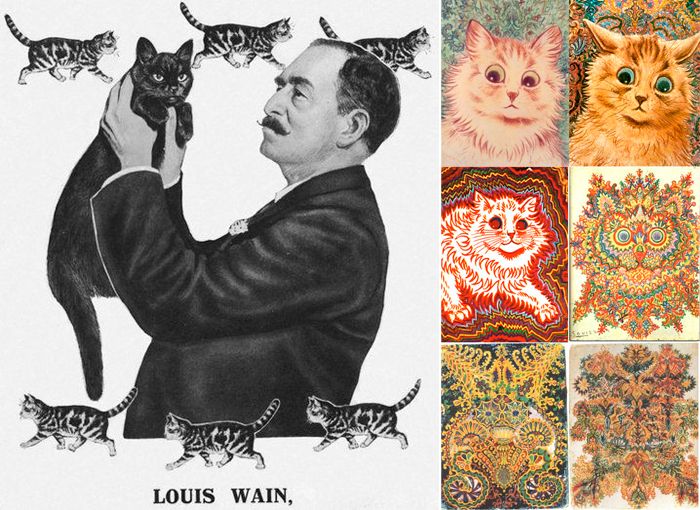
Read More: Louis Wain Cats: The Story Behind His Famous Cat Paintings
Value in Art Examples
- The best way to grasp the concept of value is to analyze real works; the examples below are all well-documented and illustrate distinct trends. Some pieces may have been rehung or reinterpreted by the museums, so double-checking the information on the organization’s website is advisable if further research is needed.
Chiaroscuro in Caravaggio’s Paintings
- The Italian painter of the Baroque period was notorious for dressing his models in black and using a single light source to cast dramatic shadows on the walls. In his works, such as The Calling of Saint Matthew, the contrast helps the artist achieve an astounding effect of a moment captured in time. This is one of the most apparent examples of value in art.
- Rembrandt’s Use of Soft Shadow
- In many ways, Rembrandt’s work is similar to Caravaggio’s, except that Rembrandt tends to use much more subtle lighting. Again, the use of contrasting shadows and highlights is evident in almost all of his portraits. However, the transition in his pictures is usually more gradual, helping to achieve a specific effect unique to Rembrandt’s portraiture. Comparing the two masters’ use of value is an exercise in itself.
Charcoal and Graphite Drawing
- Value is the cornerstone of any drawing class. When drawing objects, the students often practice still-life exercises on a white background, using charcoal. Although the subjects of the still-life may vary, the basic principles of value remain the same: the image is constructed using highlights, light tones, midtones, core shadows, reflected light, and cast shadows. Exercises like that help trainees to understand how a picture is constructed with value alone without any colors involved.
Photography and Film Noir
- Black and white photography is essentially an experiment in value. The same goes for the film noir aesthetic, common in 20th-century movies for its dramatic effect. The entire premise of the two media is to utilize the contrast between light and shadow to the maximum extent possible to heighten the tension of a scene or a photograph. Even though photography is not painting, the lesson of value remains the same.
Impressionist and High-Key Painting
- While many artists use dark shades to create shadows, the impressionists were notorious for the opposite approach. The goal of their works was to capture the effect of natural light, especially sunshine. They tended to use much lighter colors and juxtapose them with darker ones to suggest the presence of shadow without disrupting the overall brightness of a picture.
Value in Everyday Life
- No museum is required to observe and appreciate the role of value in art:
- a lamp’s cone of light on a darkened wall,
- fog making the contours of distant trees indistinguishable from the sky,
- a road sign that is starkly lighter than the road ahead
- or
- a black-and-white icon of an application one uses daily.
How to See Value Instead of Color

Seeing value is a skill, and it can be practiced. Color can fool the eye, which is why many artists use simple tricks to check their work.
Try these methods:
- Squint. Narrowing your eyes reduces detail and color, leaving the big light and dark shapes.
- Take a grayscale photo. Most phones can convert a picture to black and white in a few taps. Do this for your reference and for your work in progress.
- Use a red filter or red transparent sheet. Some painters use this to cancel out color and read values more easily.
- Step back. Viewing your work from a distance shows whether the light-dark pattern holds together.
- Make a small thumbnail. A tiny sketch of three or four values forces you to simplify.
Common Mistakes to Avoid
Most value problems are easy to fix once you know what to look for.
- Working with too narrow a range. Beginners often fear dark tones, so their drawings stay in the light-to-mid range and look faded. Push your darks deeper than feels comfortable, then adjust.
- Making everything equally contrasty. If every edge is sharp and every area is high contrast, nothing stands out. Save your strongest contrast for the focal point.
- Ignoring the background. A subject placed against a background of similar value will disappear.
- Choosing colors without checking their values. Two colors may look different but sit at the same value, which can make a design look flat or vibrate.
- Adding black to darken every color. Black can dull colors. Many painters mix darker versions using deeper colors instead. This is a matter of style, so experiment to see what works for you.
- Shading without a clear light source. Random shadows confuse the viewer. Decide where the light is coming from first.
Key Takeaways
- Value is the lightness or darkness of a color or tone, and it is one of the elements of art.
- It creates depth, directs attention, sets mood, and keeps images readable.
- Chiaroscuro, charcoal studies, black-and-white photography, and high-key landscapes all show different uses of value.
- Squinting, grayscale photos, and small thumbnail sketches are easy ways to check your values.
- The most common mistakes are a narrow value range, flat contrast, and ignoring the background.
- Practice with a simple five-step scale and a single object, and your work will improve quickly.
Frequently Asked Questions(FAQs)
Is value related to brightness/saturation?
No, it’s about lightness versus darkness. Saturation, also known as chroma and intensity, is the amount of color. So, a hue can be desaturated (make it grey), but that doesn’t make it lose its value.
Is it used only for black and white drawings?
No, all colors have a value. It’s just that a monochrome drawing makes it more apparent.
How many values should there be in a drawing?
It’s subjective. Many artists reduce everything to three to five values when sketching and then add as many as they want when actually creating the work.
What’s the difference between value and contrast?
Value is a shade’s darkness or lightness. Contrast is the amount of difference between two or more values.
I can do without value, right?
You can; it’s just that you won’t be able to deliberately control the shading, depth, or focus to properly depict what you want; hence, it’s taught in art schools.